BARBELITH underground
 

Subcultural engagement for the 21st Century...
Barbelith is a new kind of community (find out more)...
You can login or register.


'Thomas Heatherwick's East Beach Café [PICS]


Twice
19:30 / 12.09.06
I think it’s yummy , and then I don’t. It looks totally vile at the moment and has been called ‘slug’ and ‘turd’ by those who have seen it as it is now. I’ve heard people locally say that they read a BA Magazine article about how lovely the food is. Others have said they heard about it in teh London. It doesn’t exist, quite.

It’s a shock for the town, and admittedly adventurous.

Thomas Heatherwick I like a lot, but this thing has me split down the middle, as I have to look at it daily.
Does anyone else have local art or design which leaves them cold, or hot, or lukewarm, pleased as punch or downright angry?
 
 
Olulabelle
09:40 / 13.09.06
I love Thomas Heatherwick. I like his little foldy-uppy bridge. I'd be delighted to live near the building you are linking to because a/ it's on the beach and b/ it looks like shells and sand and waves all combined together. I can see how people might go down the turd route, but I don't think that myself.

I'd be interested to know how it came about; I wouldn't have thought Thomas Heatherwick would be building little cafes these days.

Twice Five Toes, can you take some photographs?

I live near the Selfridges building, which is quite contentious, although it was in the top ten of the nation's favourite buildings in 2005. I really like it. I really like the outside with all the little disks over it and I think it's beautiful inside - it truly is a temple to consumerism, a modern cathedral of shopping.

This is the outside:


Twice
10:36 / 14.09.06
The cafe's conception is shrouded in mystery! There was a great hoo-haa at the time of the planning application, which was supported by the council and managed to get round some archaic (but previously strictly enforced) no-building covenants. In local bar rooms, accusations of phenomenal backhanders flew freely. The site is privately owned and the project privately funded. How they got Thomas Heatherwick involved is anyone's guess.

It's still only half up, and nothing like the colour in the artist's impression. It's almost black with rust, although I'm told that the rust will be 'developed' to a certain point and then the whole structure sealed to arrest the process.

I'm not photo-prepared, I'm afraid, but the first link above contains a nice slide show showing the building process to date.

Selfridges is a right cracker. I'd love to see it.
 
 
neutral
14:46 / 03.11.06
im not listening lalalala, dont you burst my thomas heatherwick bubble lalala!! I can empathise, i grew up in a snotty town in the north east of scotland and they were constantly throwing up buildings that appeared to be interesting before the council tampered with them so much they resembled, well something that didnt even inspire a negative reaction!
 
 
yawn - thing's buddy
17:37 / 24.12.06
yeah, I like heatherwick a lot - he's a great sculptor (those beads on strings in the lobby) and product designer (that roll-up bridge)- but I think his architectural work (this, the buddhist temple, his skyscraper ideas) is well, just not very good.

He finds sculptural solutions to architectural problems; occasionally sculptural architecture works very well; Eero Saarinen (twa terminal etc.), frank gehry and zaha hadid have all produced some excellent works using this approach.

imo, so far, heatherwick hasn't.

to answer your question though, I'd have to say the list is to long to even start here!
 
 
Tryphena Absent
16:25 / 25.12.06
Perhaps someone could take a photo of the actual building and pop it in this thread?
 
 
Twice
19:11 / 23.09.07
I’m so sorry to bump this after such a long time. I’ve passed this edifice over and over and each time I get a thrill of guilt that I never followed this thread up. Nowadays I own a camera, and have taken some snaps.


Twice
19:31 / 23.09.07
I'll come clean. I spend my working life travelling up and down the south coast of England and see this quite freqently. I watched it, terribly slowly become a whole building. When I started this, it was expected that the building would be finished very soon. That was wrong: it was more than a year overdue and (lord help me but my source is reliable) nearly a million pounds to complete.

Locally, there was a great deal of anger. Traders were horrified by the appearance of a building which slams full frontally against the measured and undemanding nature of the town. This town has had a great big amusement arcade on the seafront for 50 years, yet still people balked at the prospect of a little kiosk.

So. Let's look at it.

It was sold as a work of art, and it is. It was constructed in many parts and welded together on site:


Twice
19:38 / 23.09.07
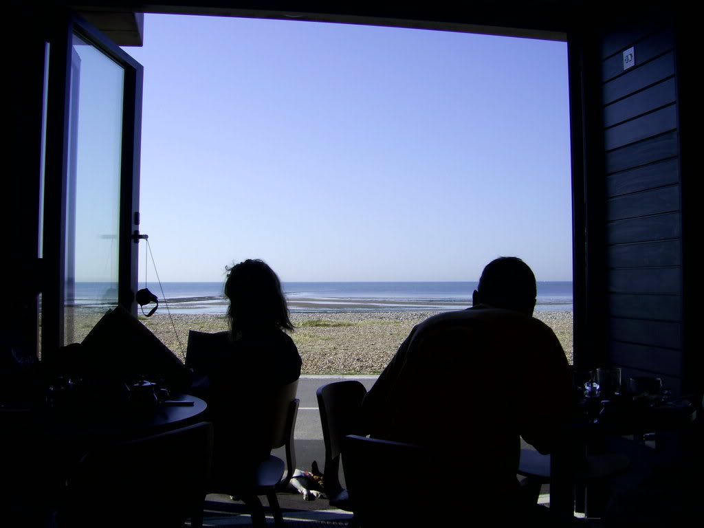
Inside is, at first glance, like a 1960's mistake. There are wavy moulded lines and simple tables. Amazingly, despite its iron shell, the inside is cool. Sitting there, you are able to concentrate on the view rather than the interior. Still, though, inside is calm and good, and a pleasant place to be.


HCE
04:44 / 24.09.07
That building is kind of amazingly ugly. I am not opposed to such things on principle. I think I'd have to see and experience it in context.
 
 
Olulabelle
21:05 / 24.09.07
I really like it but I think it is because I like Thomas Heatherwick so much that I like it. I watched a programme about him and fell quite in love with his working processes and his descriptions about how he comes up with ideas.

I think I am quite biased.
 
 
HCE
06:03 / 26.09.07
I don't think there's anything wrong with that kind of bias. I don't really buy into the notion of plunking art (or buildings, or music) into some kind of void so they can be experienced without the taint of the artist.

Yes, I said taint.
 
 
Twice
18:17 / 26.09.07
Also, I think something needs to decide whether it is art or not. Like Olulabelle I was predisposed to like it a lot, and as it grew, section by section, I liked it more. Then, as it became a working building, and as the final touches were added, a number of failings came to light. The first, and most serious (to me) is a failing by Heatherwick to display the building to its potential customers. The building is visible at its best from the land side, which is fine, but the vast majority of walking customers (the building is on a promenade) will approach from the west, seeing this (apologies for focus):
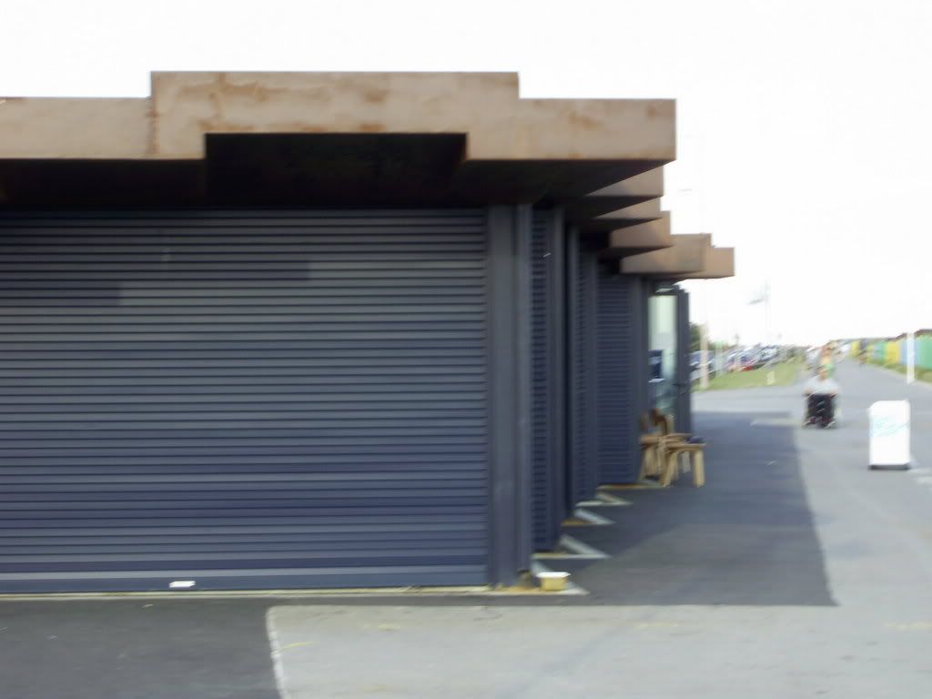


I think Heatherwick made some concessions. While it was being built, the metal went up new and quite quickly began to weather and rust. It looked great, and was very much the 'organic' feel that he had said he was aiming for. Sadly, it was necessary to coat the metal to arrest the rusting, which resulted in the slightly plasticky appearance. The intention was there; he couldn't pull off what he wanted but did it anyway.

Just for context, here's what you look at when you sit insode eating the rather delicious un-cheap food:


Olulabelle
14:02 / 29.09.07
I am very disappointed to see it is not so luscious all the way around. The view you get from the west really lets it down - it's not a piece of art or even an acceptable piece of art from that side. it's just an appallingly shoddy building. It looks like an old toilet shelter or something.
 
  
Add Your Reply